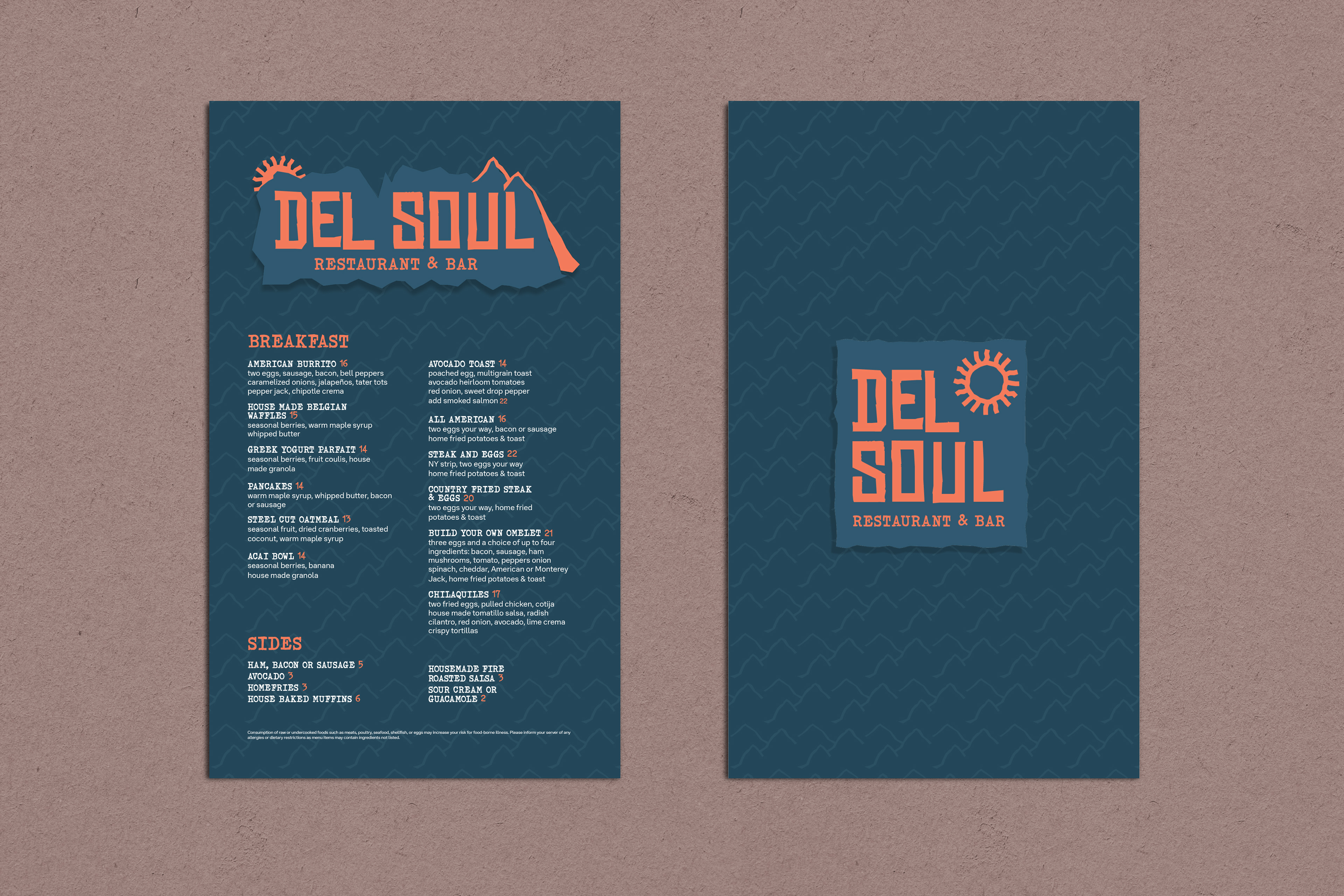
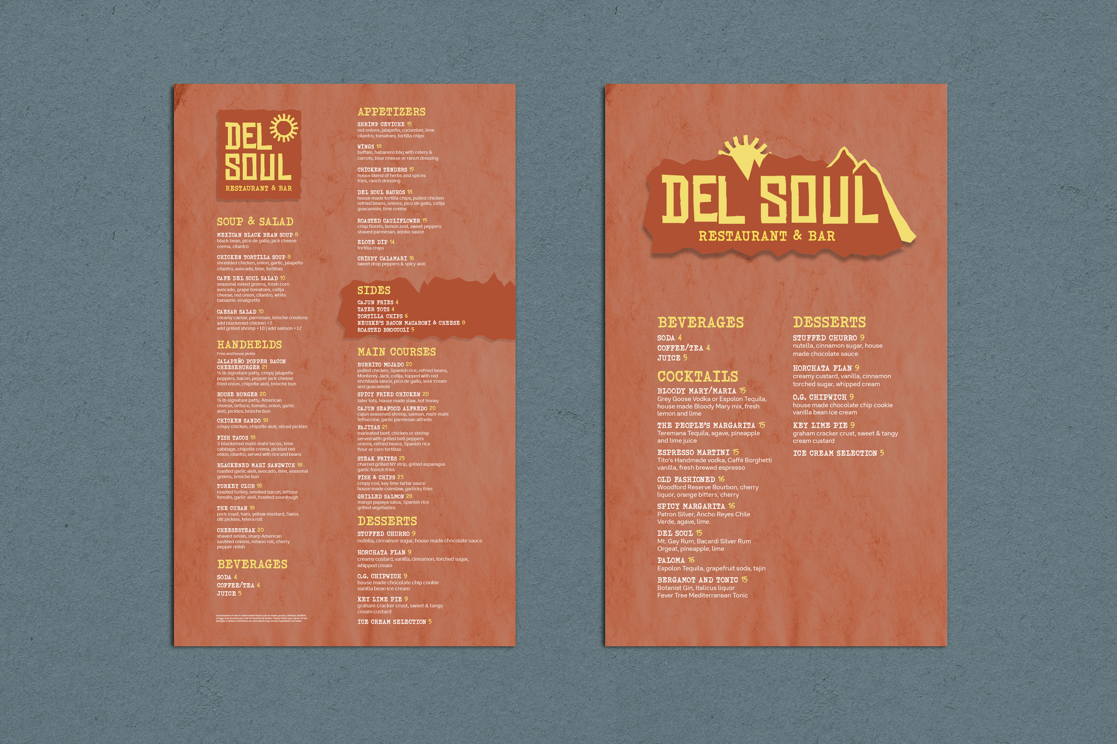
Bally's Lake Tahoe has had "Café Del Soul" as a staple of their property for years now. Recently I helped refresh the brand identity to bring it to a more modern, and latin vibe. The previous logo lacked individuality, had too many colors, and a very dated look.
To kick off the rebranding, I started by creating a mood-board in order to help build some visual vocabulary. I continually referenced this throughout the brainstorming process.
Many avenues were explored using different colors, fonts, and treatments. Eventually the font choices had a such rigidness to them, that leaning into a rocky aesthetic similar to the Lake Tahoe Mountains was a natural progression. This then helped give it a more defined direction. The sun was then brought in as Del Soul is a direct translation .
Below are the client chosen logo treatments. A pair of a primary, and a secondary horizontal logos with treatments for both morning and daytime.
Both a breakfast and lunch menu were created for the restaurant. The breakfast menus horizontal logo has the sun just rising up behind the mountains with a cool/ dark color palette signifying the morning. While the lunch menu has the sun up in the sky with a warm/ bright color palette. This was done as a fun branding detail to help bring it back to the sun thematically.
